Many Australian business owners face the challenge of having to make their websites responsive across different devices.
You’ve probably noticed that different websites look and work pretty well both on your laptop and your smartphone. But have you ever wondered how is that possible?
If the answer is yes, then you’re in the right place. We have made a little guide to help you understand how websites can be responsive across a wide variety of devices and screens.
Let’s dive right in and figure out this responsive design thing.
What Is Responsive Web Design?
First things first, let’s talk about responsive web design, also known as RWD or just responsive design.
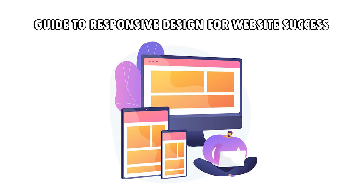
To put it simply, responsive design is a process of creating a web design that both looks and works well on many different screens and devices such as smartphones, laptops, tablets, computer screens, and even TV screens.
It’s because of responsive design, that your website is a multi-device website.
Technology and coding are two main reasons why responsive design is possible. But more on how to create a responsive design later. Right now, we should discuss all the reasons why responsive design is important.
Why Is Responsive Web Design Important?
About a decade ago, we couldn’t have even imagined that we would have the Internet in the palm of our hands anytime and anyplace.
With the development of technology, all that is possible, and now we also need to quickly adapt, face different challenges, and make things more user-friendly.
Today, with so many devices and screen sizes being used on daily bases, businesses had to find a way to make their websites look good and work well across all these gadgets.
If you’re one of those businesses looking for ways to make your website design responsive, consider contacting professionals from the graphic design Perth firm.
With that said, let’s see why responsive design is so important.
1. It increases traffic
We’ve all experienced this, if a website takes too long to load, we simply leave it and never look back at it. With the responsive design, this won’t happen and your site will load properly on all devices.
This in turn will slowly increase the website traffic. Having a responsive website design is a huge flex in the business world because it can give you a competitive edge over your competitors. Customers are more likely to come to your website than the one that takes forever to load.
2. It improves user experience
This point and the one above are closely connected. Great user experience and increased traffic go hand in hand. If you have a responsive design, you’re providing your customers or audiences with a consistent experience.
And this is something they expect from you nowadays. The better the user experience the better the website traffic!
3. It provides higher conversion rates
If you’re having problems with low conversion rates, it might have something to do with your site not being responsive enough. The responsive design of your website can seriously affect conversion rates.
This means that the more responsive your design, the higher your conversion rates will be.
4. It’s SEO friendly
Responsive web design will improve your SEO. If your goal is to rank well in SERPs, making a responsive web design is a good way to go about it.
With it, you won’t have to worry about duplicate content penalties. One version of a website across all devices will reduce all these risks and you’ll be able to focus on improving only one site.
5. It facilitates maintenance and development
This one is pretty self-explanatory – having to maintain and develop only one website is much easier than having to do so for multiple versions of the same site. This is not only time-saving but also less stressful.
How to Create a Responsive Design for Website Success?
Now that we are aware of some of the reasons why responsive design is important, we can move on to figuring out how to create a responsive web design.
1. Hire professional web designers
If you’re not an expert on web design, the best would be not to gamble and let the pros do what they do best. Hire a professional web design company and let them handle the whole process of making a responsive design for your website.
2. Start with the mobile-first approach
However, if you want to try web design yourself, this is the way to go about it. If you want to achieve the best results, start creating a mobile design first and then go from there.
Also, keep in mind that mobile users don’t like zooming in and pinching to be able to see on smaller screens. This means that you should rely on larger and more intuitive designs.
3. Incorporate fluid grid
Unlike before when websites were based on pixels, today they are built on a fluid grid. What that means is that a fluid grid is responsible for placing and setting web elements on your site so that they are proportionate to the screen size and device where it’s being displayed.
4. Don’t forget about touchscreens
Mouse and keyboard are one way of interacting on a website, but let’s not forget touchscreens as well. With touchscreens in mind, you need to make sure that all touchable elements are large enough, have simple navigation, and have enough swipe space.
We can say without a doubt that responsive web design is crucial for the success of your business. Customers expect the best and most consistent experience and they won’t settle for anything less.
So, if you want to have a successful website and thus business, you need to make sure that your web design is responsive across all screens and devices.