For the past few years, responsive website design has dominated websites, improving how businesses create their online presence. A responsive website can adapt to the screen it is viewed, regardless of the device.
The website with responsive design automatically reformats the user with a better experience suited to their device. It can provide your website with many benefits and comply with Google recommendations. For example, it prevents images from being larger than the screen width, making it easier for users on mobile devices to view your content.
Although responsive web design was first introduced in 2010 and has been recommended since 2015, there have been numerous other significant updates to web design since then.
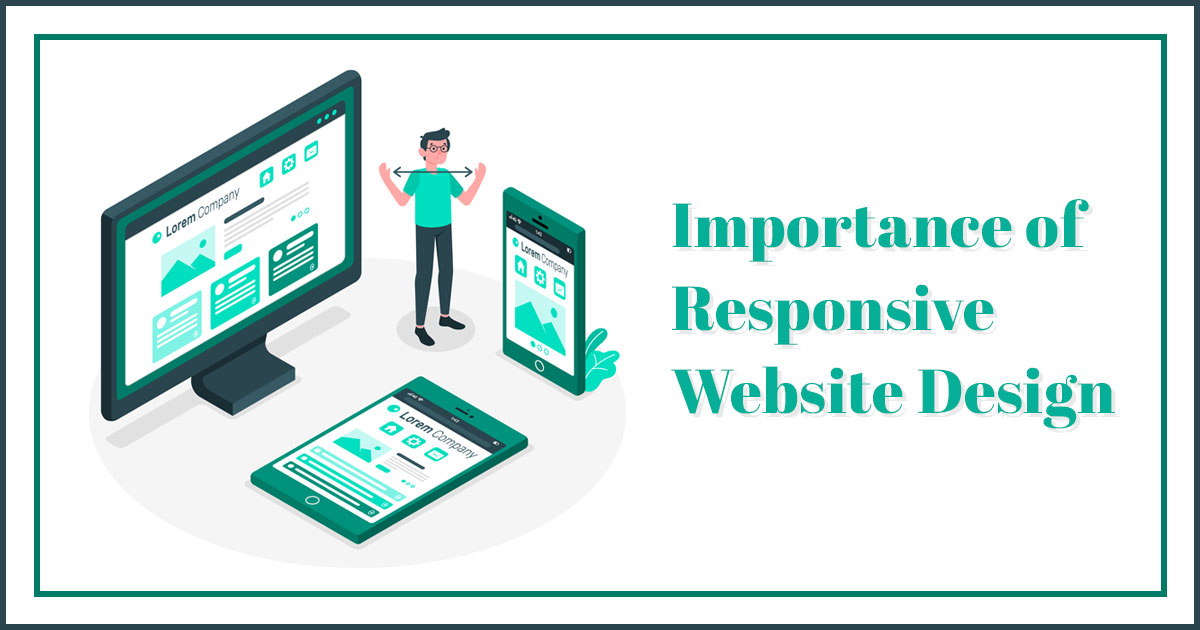
Importance of Responsive Website Design
The ultimate purpose of responsive design is to eliminate the need for unnecessary resizing, scrolling, zooming on websites that are not mobile-friendly. Unfortunately, navigating these sites is often challenging, and it may cost you potential customers who become frustrated trying to figure out how to do something.
It lets a company put its best foot forward and provide a great browsing experience for website visitors. Website visitors appreciate and even expect a well-designed online storefront while searching for a company on the internet. As a result, progressive companies now understand the significance of responsive website design.
-
Improves Your User Experience
Your visitors will have a great experience on your website if it is designed to be responsive, regardless of which device they are using. Visitors will likely spend much time on your website if they see how well it scales and responds to changes in scales, as well as how easily they can reach all of the menus and buttons. However, they will probably leave if they find it challenging to navigate and constantly pinching and zooming in content.
-
Higher Conversion Rates
According to research, the average Smartphone conversion rate is 64 percent greater than the average desktop conversion rate. It is clear why creating a responsive website with a positive user experience is the key to increasing conversion rates.
Your visitors will gain trust as they give more time to your website, which will result in higher conversion rates. In reality, getting redirected whenever a user wants to subscribe to a service, whether signing up for your newsletters or making a purchase, can be frustrating.
-
Flexibility
You can make changes to your website quickly and efficiently if it has a responsive design. You will not have to bother about updating two different websites. When you want to make a quick design tweak or fix a typo on your site, this flexibility comes in handy because you only have to do it once.
-
Lower Bounce Rates
The percentage of visitors who leave a website after visiting only a single page is the bounce rate. Your website visitors will have no issue staying on your site for more extended periods since a responsive website gives a far better user experience. In addition, a responsive website will entice them to click and explore the other different aspects of your website as they stay longer.
-
No Duplicate Content.
When you have two versions of your website, you are essentially creating duplicate content all of the time. Because search engines will not know which content is relevant, both versions of your website may have lower search engine ranks.
You would need two different SEO strategies and campaigns for both versions of your website to rank well in search engine results, which would take more time and money. On the other hand, create a responsive website, and you will save yourself a lot of time and money.
-
Gains from Search Engine Optimization
Many businesses use search engine optimization or SEO to improve their search page rankings on Google. The higher up you are on the page, the more likely potential customers will find you.
Responsive design can help with SEO since Google prefers mobile-friendly websites. Therefore, when combined with other SEO factors, responsiveness can help you get a significant rise in search engine results.
As Google Recommended, a responsive website design pattern. Furthermore, it boosts your SEO efforts across all platforms and brings a better user experience.
-
Effective Web Development
Whenever website owners detected a smaller screen size, making a separate mobile version was common practice. Creating a single responsive website, on the other hand, takes even less time than making a regular desktop website. Furthermore, designing two separate websites would cost you more than creating just one responsive website.
-
More Sharing on Social Media
A responsive web design can also improve the number of ways your website’s content is shared on social media. When your website is responsive and has responsive social media share buttons, it is more comfortable for users to share embedded links, even on smaller screens.
As a result, the increased website traffic and conversion rates result from more social media shares, introducing your brand to new audiences. Furthermore, increased search demand and engagement of your website would be noticed by search engines, which will improve your search engine results.
-
Simple Management
Most businesses, particularly smaller ones, do not have much time to maintain or refresh their website’s look. Responsive design will allow you to make changes fast and easily yourself.
Other aspects of your marketing will be considerably simpler to manage if you only have one website. You will never have to wonder whether to connect to the mobile or desktop site in a social media update or if all of your redirect links will function to send the correct people to the right website. Responsiveness alleviates a lot of the burden that appears with running a business website.
Efficiently Increase Your Website’s Traffic with Responsive Design
In comparison to desktops and laptops, mobile phones are used by many people to access the internet. As a result, your website must look great and work properly on tablets and smartphones, just as on desktops and laptops.
Velocity Consultancy is a leading digital marketing agency and web designing company. We understand that every business is unique; thus, we offer customized, one-of-a-kind solutions for each client. By providing the right solutions, we assist our clients in reaching their goals. We focus purely on the development and design of industry-leading websites.
Your business needs responsive design, and we provide it. We make your website look attractive on a variety of smart devices.