Shopping cart abandonment plagues all ecommerce websites to a certain extent, and it’s only to be expected. After all, there will always be people who just want to see how much shipping will cost or people who decide at the very last minute that they would rather not spend the money.
When cart abandonment rates are high, you obviously want to do everything you can to reduce them. The trick, however, is doing this without being obnoxious and barging into your shoppers’ inboxes, reminding them to check out.
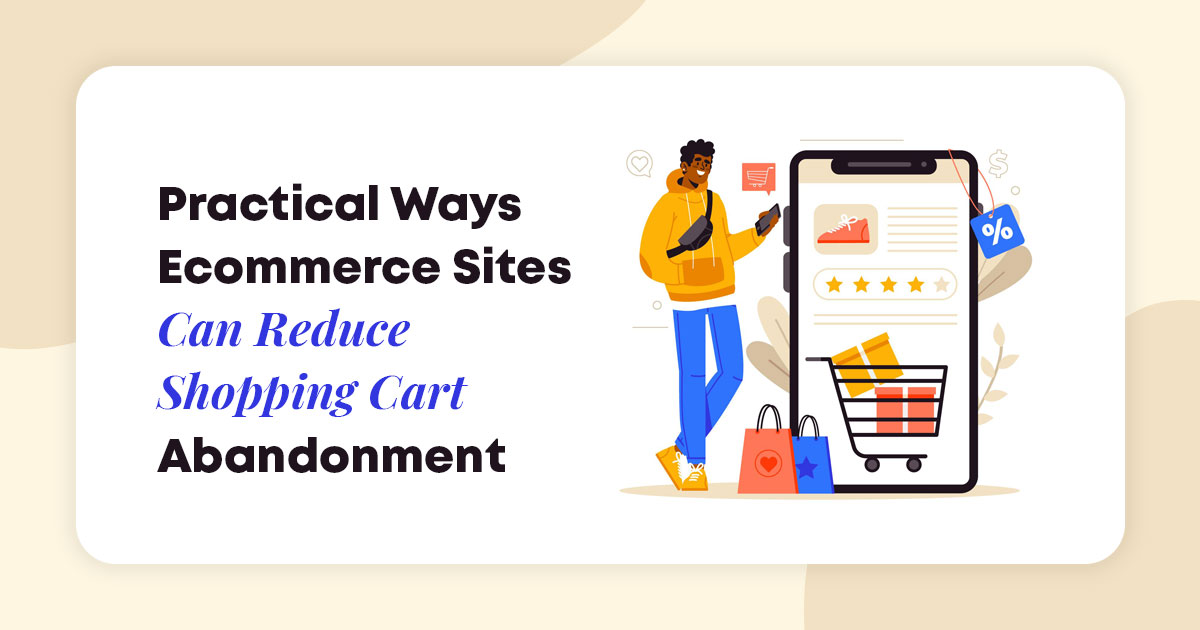
So, let’s take a look at six practical and effective ways to improve conversion rates for your e-commerce store by reducing cart abandonment and without resorting to email marketing.
Offer Free Shipping
Free shipping can often make all the difference. Customers are much more likely to make a purchase if all they are paying for is the actual product.
Understandably, you may be selling items that will require you to charge certain shipping rates. If this is the case, try to implement a threshold for free shipping. This tactic will also increase average spend.
Before you take the plunge and advertise free shipping, make sure to carefully analyze its costs. Shipping is, after all, never actually free: you will be the one who has to cough up the cost. Depending on the destination, you may want to adjust your threshold. Just make sure you don’t make certain audience segments feel less privileged than others.
For example, Colour pop has two different free shipping thresholds: one for domestic customers and another for international shoppers. While it is literally doubled, it’s still low enough, and the price of their products also means that $60 goes a rather long way.
Notice that they don’t discriminate between shoppers living in the UK and those living in Asia. International shipping is international shipping, no matter where you are located.
Impossible also offers free shipping on domestic orders above a certain price. They’ve used the same design tactic and feature a floating header at the top of their pages. This ensures website visitors are at all times aware of the amount they need to spend to qualify for the free shipping option.
Make sure you clearly display your shipping rules across the entire website – especially if you offer free shipping on all orders at all times. Your customers will want to know; the sooner, the better. Additionally, it is useful to provide a moving cost estimator for consumers who plan to move out to another location before their shipment has reached their destination..
Highlight Your Dedication to Transactional Security
In order for a customer to check out, they need to feel absolutely safe. When they’re making a purchase from a website that is new to them or that is not a household name, this will be an especially important consideration.
Online transactional and personal security is an issue more and more shoppers are becoming aware of, in part due to the increase in online purchases and the number of online stores during the pandemic.
In order to assuage a lot of these fears and doubts, your best course of action is to clearly display how secure your checkout process is. Sometimes, something as simple as featuring the logos of the checkout options you provide can do the trick.
On the other hand, anyone can display a PayPal logo on their website and not actually be a legitimate business. In fact, fraudulent websites will accept all manner of payment options but never deliver on their promises.
Using a trust badge can significantly help boost your conversion rates. While Norton and McAfee used to be the top dogs in this game, Trusted Site now seems to be the one most customers will want to see.
Burt’s Bees uses their services, and they’ve clearly highlighted the fact in their footer. Since this is the space where most privacy and security information is expected to be found, customers are likely to spot it and register it at least subconsciously.
Offer Guest Checkout
While we’re on the subject of online security, let’s highlight the importance of offering guest checkout.
A lot has been done in recent years to protect the privacy of online shoppers, but data breaches are still common. The personal information of customers often ends up somewhere on the dark web.
Customers may thus be hesitant to register an account with your store. If they don’t see themselves becoming frequent shoppers (at least not yet), or if they simply want to save some time and check out without having to remember a password they came up with months ago, they will appreciate the guest checkout option.
Registering an account has its benefits both for you and the customer. They can create a wishlist and keep track of their orders, while you get access to more information about them, which you’ll use to offer more personalized marketing services.
By offering both of these options, you will ensure that all of your customers are essentially satisfied. Even users who do have an account should be able to check out as guests if that suits them better for whatever reason.
Mannequin Mall offers express guest checkout, and they’ve made the process itself super simple and fast. All you need to do is fill out one form, and select your preferred payment method. You don’t need to spend more than a minute checking out (provided that you know your card number by heart, or at least know where the card is).
Make Use of Social Proof
Social proof is another incredibly important trust signal you want to include on your website, inspiring more of your audience to complete their checkout.
As social proof comes in so many shapes and sizes, you will have to make an educated decision and choose the format that will appeal to your audience the most.
Testimonials will often let you highlight certain aspects of your products and brand by leaning on your customer’s word choice. When someone who has spent their own money in your store states that the product has lasted them very well, that it was exactly like in the images, or that it has solved a problem particularly well, readers are likely to trust the statement.
Reviews (especially if they come with images) are another great option, as they come with that useful 5-star feature that is nice and neat to display. Just make sure you aren’t getting 5 stars for every product, as that will seem fake.
You can also take your social proof a step further and reach for some external validation. Whether you feature your Google reviews or partner up with a website like Trustpilot, you will be sending quite a clear message: This brand can be trusted, and their products are actually good.
Mixam has a Trustpilot widget on their pages, which displays their latest reviews. It’s a great way to keep this content fresh and to prove to visitors that others are using the brand’s services on a regular basis.
Cotswold Raw is also using Trustpilot, but they’ve made their widget much smaller and are only displaying their 4 and 5 star reviews. It’s not the best choice, perhaps, as they also have lower ratings, so the decision may seem a bit questionable.
If you are going down the Trustpilot route, make sure you don’t hide any of your more negative reviews: they will testify to the honesty of your customers.
Be Available to Answer Questions
Sometimes, customers will just want to chat with you, either to get their questions answered or to make sure that you are a legitimate business and are familiar with your own products.
The more communication avenues you offer, the better. You may not be able to answer the phone at all hours of the day or reply to an email in a matter of minutes, so also displaying your working hours can alleviate any frustration on the part of your customers.
This will naturally increase the cost of running your business if you need to hire someone to handle all customer queries. You can always delegate this task to a member of your current staff, especially if you don’t get many questions. Just make sure that the person communicating with your customers is both pleasant and knowledgeable. As 1 in 3 customers will ditch a brand after a single bad experience, you need to ensure you leave room for none.
As for the best way to display all of your contact options, take a look at Rain or Shine Golf. Note the clickable phone number and the link to their contact page in the header. Plus, they have a live chat feature and even encourage their customers to text them.
A similar layout can work very well in any niche – whatever communication channels you decide to offer.
Address Common Shopper Concerns
Finally, in order to cut down on the number of queries you get and to assuage a lot of customer doubts right off the bat, you should also clearly address the most common concerns on the website itself.
You can do this on an FAQ page, or you can answer commonly asked questions on your product pages. Ideally, you will do both, as you never know where a customer will look for answers first.
Whenever you get a real-life question from a shopper, make sure to write it down. Even if it has been asked by just one person, if it allows you to provide more details about your brand or products, make sure to include it on your website.
Here’s a clever way to feature some common issues. US Fireplace Store has a section underneath the main CTA that addresses their returns policy and the expected delivery times of their products, as well as any hidden costs that customers may be concerned about.
What makes this solution work so well is the fact that the visitor is allowed to stay on the same page, looking at the product they want to buy, and does not need to navigate the website further to get the answers they are looking for.
Final Thoughts
Don’t forget to take a good long look at your sales funnel and the store itself. Perhaps there’s a glitch somewhere that is causing your high cart abandonment rates.
Once you’re certain every element is working as it should, consider implementing our tips, and make sure your staff and bandwidth are able to handle the influx of orders.