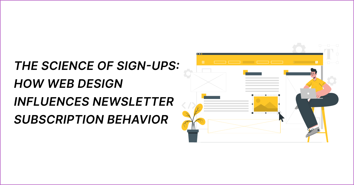
Web design plays a key role in shaping user behavior and interaction patterns, and it’s no different when it comes to newsletter sign-ups.
In this guide, we aim to uncover how each web design element influences visitors’ newsletter subscription behavior. We offer essential and actionable explanations for how optimizing your website’s design is bound to effectively boost sign-up rates, so keep reading to learn more.
1. Strategic Placement and Timing
The clear first law of our science is that a properly placed sign-up button on your website will significantly increase the likelihood of subscriptions. Such a placement takes into account not only visibility but also the specific moment in a user’s website journey.
For starters, the sign-up button is obviously best placed in a prominent position (depending on the specificities of the website, this could also be a condensed sign-up form, including just a single field for an email address and a submit button).
If we place it above the fold – the part of a webpage that’s visible without scrolling – this makes it optimally visible.
But beyond simply placing the sign-up button or form above the fold, it can also be helpful to integrate it in other locations where users are likely to notice it easily.
This strategic positioning includes the end of a piece of compelling content, on the sidebar while they’re reading blog posts, or even as a floating element that remains visible as a user scrolls, which all makes the option to subscribe more visible.
2. Properly Seizing Stopping Points
As a user travels the website, they come upon natural, so-called stopping points.
These happen when users have reached a logical pause in their navigation, which is an opportune time to present a sign-up prompt.
Stopping points are effective for capturing user interest because they capitalize on the moment when they’re likely considering what to do next.
Here’s a list of such frequent stopping points:
- End of a blog post or article
- After watching a video
- Completion of a quiz or interactive tool
- After a purchase
- On ‘Thank you’ or Confirmation pages
- During event registration
A special case is an exit-point. By using exit-intent technology that tracks mouse movements: a cursor’s position, direction and velocity, a website can display a pop-up when a user shows signs of leaving the page. Use this and other stopping points to your advantage.
3. Design that Draws Attention
It’s not only about when and where you display the sign-up prompt, but also how. For one, a clean, uncluttered design encourages users to focus on the subscription option without getting overwhelmed by too many elements on the page.
To further guide visitors, we can insert visual, directional cues like arrows pointing toward the prompt.
Moreover, we use colors that stand out (but also harmonize with the overall website design), drawing attention to the subscription area. Plus, a high color contrast between the text and background improves the prompt’s readability.
Another way to draw visitors’ eyes toward the sign-in prompt is with the help of subtle animations, like a fade-in or slide-in animation as the user scrolls down the page, which creates a smooth and timely reveal.
Interactive elements, like a form that expands when scrolled into view, not only draw attention, but also create a more engaging user experience.
With all this, we keep in mind two things. Firstly, the design must be responsive – meaning that it’s visually appealing and functional across all devices.
In this day and age, many users will access the website through their mobile devices, so ensuring a mobile-optimized design dramatically increases sign-up rates.
The second encompassing thing to have in mind is that the design of the sign-up form must reflect the overall brand identity. This means using consistent fonts, colors, and styles, that not only draw attention but also reinforce brand recognition and trust.
4. Building Trust through Design
Users are increasingly concerned about their online privacy, and rightly so. Therefore, we must clearly communicate how their data will be used and protected to reassure users, including that their information will not be sold or shared without consent.
We insert the link to a detailed privacy policy close to the sign-up form. This policy needs to be easy to understand and outline user rights, data handling practices, and contact information for privacy concerns.
To further build trust, but also ensure compliance with regulations like GDPR, we also include a checkbox for users to explicitly consent to the terms of use and privacy policy.
User confidence additionally increases thanks to an overall professional web design. Users often judge the credibility of a website based on its aesthetic qualities. For starters, a well-designed, professional-looking website can make a strong first impression, signaling that the company values quality and attention to detail.
But there are also other elements of professional web design (we talked already about the first two in more detail):
- Consistency in all design elements
- Responsive and mobile-friendly design
- Clean, intuitive layout with easy navigation
- Fast loading speed
- User-centered design – readable fonts, appropriate color contrasts, etc.
- Interactive elements like hover effects that provide immediate feedback
The best part is that you don’t have to hire a professional web designer or do it alone. There are many subscription platforms nowadays that incorporate these elements as part of their product offering.
5. Optimizing with Testing and Feedback
What we’ve provided so far were essential practices, but it depends on optimizing for the individual website and audience to make them fully work.
A/B testing, where you change one element to see which version works better, needs to be continuous. This includes everything from the placement to the design of the sign-up prompt and form.
Beyond A/B testing, multivariate testing allows for the simultaneous examination of different variables (like button color, form position, and CTA wording) to understand their combined effect on subscription rates.
Either way, for all kinds of testing, monitoring sign-up rates and gathering user feedback provides key insights into user preferences and barriers to subscription. In conjunction with a sales funnel calculator, you also get the data you need to prepare your sales funnel.
Establishing mechanisms for subscriber feedback on newsletter content and preferences, and regularly reviewing subscription metrics (open rates, click-through rates, unsubscribe rates) enables ongoing refinement of both the sign-up process and the newsletter content itself.
Another way to reveal insights into user behavior and preferences is to employ tools that allow one to analyze how users interact with the sign-up form (e.g., heatmaps, scroll depth tracking). Use thus gained insights to further inform design improvements.
Conclusion
By embracing strategic placement, attention-grabbing design, trust-building practices, and a commitment to optimization, websites significantly enhance their ability to convert visitors into loyal subscribers. In the end, the science of sign-ups is all about creating a seamless, engaging, and trustworthy experience that resonates with users, encouraging them to subscribe now.