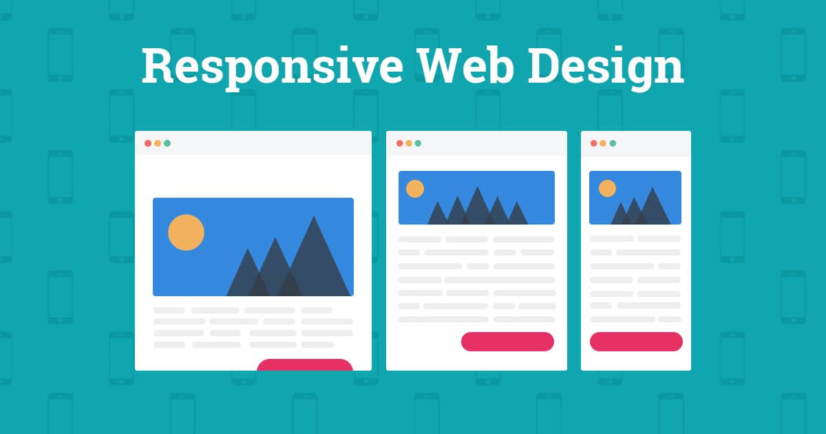
Responsive web design is an approach to website design which ensures that the users have a good viewing experience no matter what type of device they’re using. It is become more and more important over the last few years as ownership of mobile devices has increased many folds and traditional desktop computer sales have slowed down. Google too is prioritizing all device-friendly sites in its search results algorithm, it is therefore very important and necessary to make sure that your website is optimized for all kinds of gadgets and screens using a Responsive Design.
The History
Originally after the launch of the iPhone, the trend of building separate sites depending on whether a user visited the site from a desktop computer or a mobile device started. This was easier from a development perspective, however had a large number of drawbacks. The shortcomings included increasing maintenance costs, having to endorse and maintain separate sites for SEO rankings and mainly to develop different mobile sites for different types of mobile devices.
Web designer Ethan Marcotte has been credited over the years with coining the term “responsive design”. In 2010, he published an article on A List Apart discussing the fast changing environment of devices, browsers, screen sizes, and orientations. Developing separate sites for each and every type of device simply would not be feasible, cost or time consumed. As an alternative, he proposed a new concept: responsive design, which asks for building flexible and fluid layouts that are easily adaptive to almost any screen.
The Principles
Responsive web design consists of three main development principles. To get the maximum benefit of Responsive Designing, all of them have to be taken care of.
- Fluid grids
- Media queries
- Flexible images and media
Fluid Grids
A flexible grid-based layout is the foundation of responsive design. It uses relative sizing to fit the content to the device’s screen size. The term “grid” is actually a little misleading because it is not compulsory to implement any of the available grid frameworks. Instead, CSSis used to position the content. Responsive design moves away from the pixel-based approach because a pixel on one device could be ten pixels on another device. By basing the text size, widths, and margins on percentages, a fixed size can be turned into a size relative to its display space.
Media Queries
Also known as Breakpoints, Media queries can be used to apply different styles based on the capabilities of the specific device. The website automatically detects the type of device you’re using or determines the size of your web browser and then accurately displays the page. Features can be used to control the width, height, max-width, max-height, device-height, orientation, aspect ratio, etc.
Flexible Images and Media
This feature allows the adaption of images and other media to load differently, depending on the device, either by scaling or using the CSS overflow property.Scaling in CSS is relatively clear—the media element’s maximum width can be set at 100 percent, alternativelymedia can be cropped with CSS instead of scaling.