Almost 90% of the website is made up of Typography. Websites are designed and developed so that consumers can get the required information about the company and its products or services. People visit websites to read this content, therefore the words written on the website play a very important role. At the same time how these words are presented is equally important. Hence typography holds an important place while designing a website.
A website should be able to convey the intent and sentiment of the business to their online visitors. And in today’s digital world, the simplest and the best way to do so is through typography fonts. Typography website design is completely personal, it is an extension of a brand image. It is highly crucial, that one chooses the right typography fonts for their website, typeface which is suitable for your industry. The typography website design should complement the brand image of the company. Using typography fonts in website designing, helps in maintaining a consistency and making the website look aesthetically pleasing and completely professional. Typography helps in making the content attractive, it also impacts the readability of the website, all accounting for a positive user experience.
Below mentioned are some tips which will help in building a typography website design:
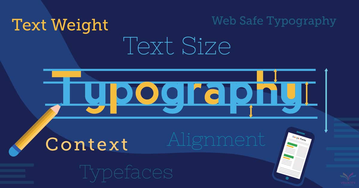
Context:
There are a number of fonts available, however it is important to understand that every industry or brand will require a different typeface for their website. For example, a beauty products manufacturer or marketing website cannot use the same typeface as used by a law firm or an engineering company. Often companies prefer using a simple font to avoid any wrong impression or communication. However at the same time using decorative fonts could also help in attracting more people to the website, fancy and innovative fonts can build interest in the minds of the viewers. Therefore it is very important that you as a company or a brand, need to decide on what kind of image you want to build? What message you want to send through your website? Once you determine these points, you can choose your typography style accordingly.
Number of Typefaces:
Using way too many fonts in a website can make it look unorganized. Use of many fonts and different colours, can confuse the viewers and distract them. It will take away their attention from the important content which you want them to read. One should not use more than 2 to 4 typefaces in their website design and for everything on the website. To give your website and business a professional, it is very important that the website design looks consistent. Using the same type of fonts and typefaces throughout the website, adds consistency to it.
Alignment:
Alignment of the text on the website page acts as a guide for the readers. Aligned text is easier to read and follow. The alignment of the text will decide how the viewer goes through the website and whether he continues reading or leaves the page. Aligned text, complementing the structure and flow of the content helps in providing a wonderful user experience.
Size of the Text:
The size of the text also plays a major role in determining the user experience. While working on a computer or laptop, people sit around 20-22 inches away from their screens. This has to be kept in mind while deciding the typography website design. The Text used on the website should be legible and large enough to be read clearly. If the fonts used are illegible or small, and a user has to zoom to read the content, it will surely have a negative impact on the user experience.
Along with the text size, line and word spacing is also important. Maintaining an accurate distance between the characters and words will have a huge impact on how the content appears on the website and its readability. Extra spacing between letters or words, will make reading simpler but will make the content look too long to read, deterring readers from reading further.
Weight in the Text:
By changing the weight of the words which you need to highlight on the webpage can help in enhancing the readability of the website. By just adding weight to the important words is a better way of attracting attention, rather than using multiple fonts. The same fonts just highlighted where required, makes the content look cleaner and neater to read.
Web Safe Typography:
A large number of web safe fonts are provided by Google, which can be downloaded for free. However before choosing your pick, remember that the fonts display differently in different browsers and platforms. One needs to keep checking periodically if their websites are web safe and keep rendering them consistently. In today’s world of smartphones, it has become equally important for developers to check if the fonts used are legible on smaller screens like smartphones or tablets.
Velocity Consultancy is a professional Web Designing and Development Company providing comprehensive and cost effective web solutions for a wide range of website design & development services. We are dedicated in assisting small to medium sized businesses establish an online presence. We help our clients in harnessing the wide reach of the Internet by designing and developing web solutions which will help them in marketing their products to a larger audience. We have worked with many satisfied clients on redesigning their old websites, helping them create typography website designs.