One needs to think about a million things while building and creating the perfect website like designing graphics, choosing the right colours, selecting the right images. However there is one area which many website designers and developers tend to underestimate is the choice of fonts. That is one big mistake. Choosing the right font like Nike font has a big and lasting impact on the final look of our web design. Selection of fonts is a small area, but it has the power to take your website to the next level. In this article let us take you through all the important aspects you need to know regarding choosing the right fonts for your web design.
Brand guidelines determine the elements which make up the brand. These guidelines are essential in communicating a reliable branding strategy. The set of guidelines will help both you and your designer in creating an integrated identity by bringing together multiple elements of the brand, by outlining the colours, the logo and not to be forgotten, the typography.
1. Fundamentals:
Working with web fonts is similar to any other typography project. You need to start with the basic fundamentals.
Serif vs. sans serif: A number of categories are available, but in case of web designing, maximum of the projects are based on either Serif or Sans Serif options. Sans serif typefaces are the preferred choice most of the times.
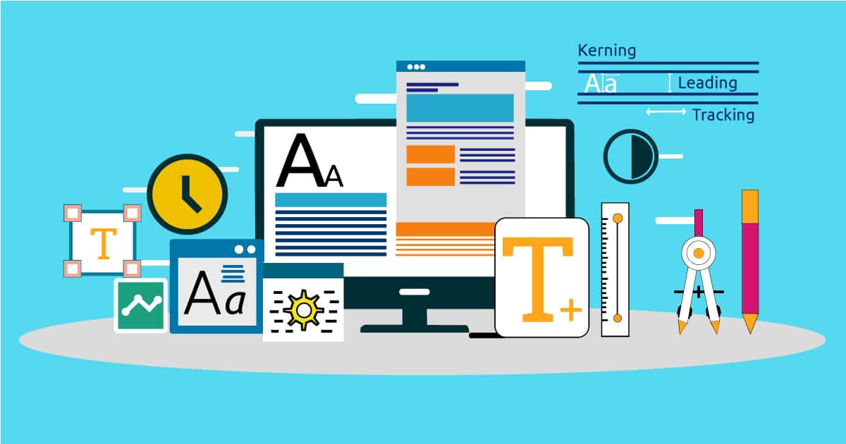
Kerning, tracking and leading: The amount of space which surrounds the text is equally important as the typeface. Kerning means the space between letter pairs; whereas tracking means the space between group dos characters. Leading means the line height (space between the lines).
Readability: While working on the text for a website, the number of characters per line is very crucial. One needs to think about the size of the screen while choosing the text, to ensure the text is readable.
Hyphenation: Do not use Hyphens if not required, as they make a mess of text on screen.
Justification and Alignment: For large paragraphs and more written matter on the website, decide on the alignment of the text. Decide whether the alignment of the text on the screen, whether left, right or centre. Also if the paragraphs of text will have ragged edges or will they be fully justified.
Contrast: You need to have enough contrast between the written text and the background to ensure it is readable. Elements which help determine the contrast are the size, stroke weight, colour and space.
2. Compatibility
The prime reason why determining a web typography is difficult is because browsers are always updating and changing. You need to select a typeface which will be compatible with modern web interfaces for both desktop and mobile devices.
Testing across multiple devices will help you find typeface which works seamlessly on all devices and browsers.
3. Web Font Service
Many web designers opt to use a web font service. This is a good idea and help you overcome any technical issues during development.
Other than Google fonts, which is the most popular option web font service, there are a number of other choices too. Google Fonts is a free service, however the pricing for the others vary from free to more expensive kits. Some of the other web font services are Adobe Typekit, Fonts.com, Webtype, Fontspring etc.
4. Tone and Message
Do not keep the font selection for the end. Start your project with font selection, things will come together easier if you have determined your font type options at the start. Visualize how the text will blend with other design elements like the colour and images.
It is very important that the typeface which you select matches with the tone and message of the website and its company. These are a few questions you need to answer before choosing the font. Is the project formal or casual? Should the text be bold or simple? Is the typeface for large text or small? Does the font type or design match the mood of message of the words being read?
5. Loading time:
If a font takes time to load, you will need to look for another option. Users do not prefer slow websites and have no patience for them. No matter how amazing the typeface, you need to ensure that it loads at near-lightning speed to create an impact.
When selecting a typeface you need to test it for speed. Then you can think of other ways which can help you reduce the loading time. For example, Using limited number of typefaces.
Final Words:
Selecting a perfect web font is one of those processes which are extremely rewarding. When you are able to find the perfect combination, you feel enthralled. At the same time when nothing seems to work, you will feel like pulling your hair. Following the above mentioned ideas, you will be able to find a typeface and system which are perfect for your website designing projects.
Velocity Consultancy is a professional Web Designing and Development Company providing comprehensive and cost effective web solutions for a wide range of website design & development services. We are dedicated in assisting small to medium sized businesses establish an online presence. We help our clients in harnessing the wide reach of the Internet by designing and developing web solutions which will help them in marketing their products to a larger audience.